


- Joined
- Dec 3, 2020
- Messages
- 2,405
Some of you might already know but for those who don’t, I’m starting a Weekly Coding Challenge with all you!
This challenge is meant to help improve our coding skills by practicing on real-life projects.
You can read more about this challenge and how you can join it by reading The Complete Guide.
Alright… so the challenge for this week was: Create a Sign in or Sign up form (or both).
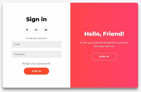
Below you can see a demo of what I’ve created:
Truth to be told, I’ve struggled a bit with creating the animation , but in the end, I managed to make it work. I was inspired by this shot on Dribbble by SELECTO — they have some awesome designs, you should check them out!
Project description
Before we move to the actual code, I’d like to break down the things we’re going to have in the component. This will help as it will make the code we write much clearer.
We have 4 smaller screens/boxes inside the main component (the .container):
The overlay animation — explained
This is where it might be a little trickier, but I’ll do my best to explain so you can understand the logic behind it.
We have the following layers for the overlay component:
The overlay-container — this will display the visible area (more on this below) at a certain moment in time. It has a width of 50% of the total container's width.
The overlay — this div has a double width size (200%) so it's taking the full width of the main container. (200% * 50%= 100%. The 50% is from the .overlay-container above).
The overlay-panels — are the divs which are holding the actual content (the text and the button) we see on the screen. They both have a position of absolute. We can position them wherever we want in the .overlaycomponent. One of the panels is positioned to the left and the other one is positioned to the right. Both having a width of 50% of the .overlaycomponent.
“Why do we need 3 layers?” you might ask… Well, let’s see how it would look like without the first layer:
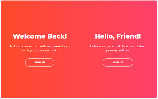
In the picture above you can see that both of the panels are “visible”, which is not what we want. This is why we’re adding the .overlay-container to act like a “focus area”. This allows us to hide the panel which is overflowing, or which is out of its boundaries. This is why we needed the .overlay to be twice as big as the .overlay-container. By moving around the .overlay-container, which also has a position of absolute, we can hide or show which panel we want.
It was a little bit confusing , I’ll admit, but I hope I made it clearer.
The forms animation — explained
These aren’t difficult to understand at all. Basically, we have again two containers — the .form-containers. Each has a width of 50% and a position- absolute. We move both of them at the same time from left to right. When they get behind the .overlay-container from above (while these are moving) we quickly change the z-index value. The Sign Up form (for example) will move on top of the Sign In form, and vice-versa. Magic to the eyes, but some code logic behind!
The HTML
Now that we have broken down the core “functionality” of the animation, it’s time to see the actual HTML code. Let’s start with the basic skeleton:
The main div has a class of .container and also an id of container because we want to target this element in the JavaScript (more on this below).
The Sign Up form
The Sign In form
We also have a few classes on each div:
You might have also noticed that the i tags have some classes. These are because we are using FontAwesome for the icons. Read more about them on their website.
The overlay container
Same as above, we have a common class .overlay-panel and two different classes: .overlay-left and .overlay-right. Also, we have ids for the buttons as we're going to add an onClick eventListener for both of them in the JavaScript.
The JavaScript
Usually, we cover the CSS before the JS part, but this time it is easier to show and explain the JavaScript code first. It will help you understand the CSS we’re going to have later on.
As explained above, we add the event listeners. When the buttons are clicked we add or remove the .right-panel-active class (not the best name for the class, but it’s the best I got at the moment ). This class will be used to style the subcomponents differently as we have two screens.
The CSS
First, we have the base CSS for the basic components:
Few things to note here:
Note the following:
Conclusion
This post was a little tough on animations, wasn’t it? Nevertheless, I hope you’ve learned something from it.
Don’t forget that you can participate too in the Weekly Coding Challenge by creating your own version of the Sign in/up Form. so I can see it!
Also, you can suggest what we should build for the next Challenge in this Google Form.
You can find the live version of the project we’ve built on Codepen.
Thank you for spending your time reading this , I hope that you learned something new!
This challenge is meant to help improve our coding skills by practicing on real-life projects.
You can read more about this challenge and how you can join it by reading The Complete Guide.
Alright… so the challenge for this week was: Create a Sign in or Sign up form (or both).
Below you can see a demo of what I’ve created:
Truth to be told, I’ve struggled a bit with creating the animation , but in the end, I managed to make it work. I was inspired by this shot on Dribbble by SELECTO — they have some awesome designs, you should check them out!
Project description
Before we move to the actual code, I’d like to break down the things we’re going to have in the component. This will help as it will make the code we write much clearer.
We have 4 smaller screens/boxes inside the main component (the .container):
- The Sign In form
- The Sign Up form
- The Sign In overlay
- The Sign Up overlay
- The Sign In form alongside the Sign Up overlay
- The Sign Up form alongside the Sign In overlay
The overlay animation — explained
This is where it might be a little trickier, but I’ll do my best to explain so you can understand the logic behind it.
We have the following layers for the overlay component:
The overlay-container — this will display the visible area (more on this below) at a certain moment in time. It has a width of 50% of the total container's width.
The overlay — this div has a double width size (200%) so it's taking the full width of the main container. (200% * 50%= 100%. The 50% is from the .overlay-container above).
The overlay-panels — are the divs which are holding the actual content (the text and the button) we see on the screen. They both have a position of absolute. We can position them wherever we want in the .overlaycomponent. One of the panels is positioned to the left and the other one is positioned to the right. Both having a width of 50% of the .overlaycomponent.
“Why do we need 3 layers?” you might ask… Well, let’s see how it would look like without the first layer:
In the picture above you can see that both of the panels are “visible”, which is not what we want. This is why we’re adding the .overlay-container to act like a “focus area”. This allows us to hide the panel which is overflowing, or which is out of its boundaries. This is why we needed the .overlay to be twice as big as the .overlay-container. By moving around the .overlay-container, which also has a position of absolute, we can hide or show which panel we want.
It was a little bit confusing , I’ll admit, but I hope I made it clearer.
The forms animation — explained
These aren’t difficult to understand at all. Basically, we have again two containers — the .form-containers. Each has a width of 50% and a position- absolute. We move both of them at the same time from left to right. When they get behind the .overlay-container from above (while these are moving) we quickly change the z-index value. The Sign Up form (for example) will move on top of the Sign In form, and vice-versa. Magic to the eyes, but some code logic behind!
The HTML
Now that we have broken down the core “functionality” of the animation, it’s time to see the actual HTML code. Let’s start with the basic skeleton:
The main div has a class of .container and also an id of container because we want to target this element in the JavaScript (more on this below).
The Sign Up form
The Sign In form
We also have a few classes on each div:
- The .form-container class will contain the CSS which is duplicated for both the .sign-in-container and .sign-up-container classes;
- the 2 different classes (mentioned above) will contain the CSS which is different.
You might have also noticed that the i tags have some classes. These are because we are using FontAwesome for the icons. Read more about them on their website.
The overlay container
Same as above, we have a common class .overlay-panel and two different classes: .overlay-left and .overlay-right. Also, we have ids for the buttons as we're going to add an onClick eventListener for both of them in the JavaScript.
The JavaScript
Usually, we cover the CSS before the JS part, but this time it is easier to show and explain the JavaScript code first. It will help you understand the CSS we’re going to have later on.
As explained above, we add the event listeners. When the buttons are clicked we add or remove the .right-panel-active class (not the best name for the class, but it’s the best I got at the moment ). This class will be used to style the subcomponents differently as we have two screens.
The CSS
First, we have the base CSS for the basic components:
Few things to note here:
- We are styling the elements directly (h1, p, a). Usually, you wouldn’t do that as it might get mixed up with other styles, so it’s good to add a class to each of them. But for this example it’s working ok because we only have these elements on the page.
- We have a little transition on the button. When it's clicked, the activestate is triggered so we make it a little smaller. Nice and simple clicking effect !
- The form is a flex container as we want to center everything within it, and it's easy to do that with flexbox. You'll see below that it's used a few more times.
- Relative positioned because we'll have absolute positioned children elements (explained why, above).
- Overflow is set to hidden because we have set a border-radius and we don't want the child elements to break this radius and be displayed outside of the .container.
Note the following:
- The animation (show) which is responsible for changing the z-index of the .form-containers as discussed above. We go by having the z-index 1from 0-49.99% and having it at 5 from 50-100%. These ranges are used because we want them to change fast.
- We use the .right-panel-active class to move around the .form-containers when the buttons are clicked.
- the .overlay has a gradient background, I used UI Gradients to get it;
- .overlay-left and .container.right-panel-active .overlay-right have a -20% and 20% translation on the X-axis. This is because I wanted to add a little effect to the text when it's displayed as if it's coming from outside (sort of) ;
Conclusion
This post was a little tough on animations, wasn’t it? Nevertheless, I hope you’ve learned something from it.
Don’t forget that you can participate too in the Weekly Coding Challenge by creating your own version of the Sign in/up Form. so I can see it!
Also, you can suggest what we should build for the next Challenge in this Google Form.
You can find the live version of the project we’ve built on Codepen.
Thank you for spending your time reading this , I hope that you learned something new!